Stock illustration hunting wastes everyone’s time. You know the drill: scroll through pages of generic businesspeople shaking hands, download something that’s “close enough,” realize it clashes with everything else in your project, start over. Icons8 built Ouch to fix this specific problem, not to add another million random illustrations to the internet.
The Component System Changes Everything
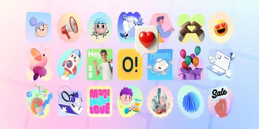
Every Ouch illustration breaks into pieces you can actually use. Characters exist separately from backgrounds. Objects move independently. Colors change across all elements at once. A workplace scene isn’t one flat image but twenty different pieces you can rearrange however you want.
This matters because real projects don’t need finished illustrations. They need visual elements that adapt to specific contexts. Your error page needs that confused character, but with your brand colors and without the generic office background. Your onboarding flow needs those device illustrations, but arranged differently for each step. Traditional stock sites can’t do this. You get what you get.
The SVG structure stays intact when you edit. No more broken illustrations after changing one color. File names follow predictable patterns so your build scripts can find them. When your marketing team needs fifty variations for testing, they’re manipulating structured data, not starting from scratch fifty times.
File Sizes That Don’t Break Your Site
Complex SVG illustrations compress to 15-30KB. That’s smaller than most logo files. PNGs export with transparency built in. No manual masking. No white backgrounds you forgot to remove. The platform generates multiple resolutions automatically.
Animation files stay tiny too. Lottie JSON animations run 40-60KB for complex sequences. They work directly in React, Vue, and vanilla JavaScript. Rive format gives you timeline control for interactive stuff. After Effects projects let you customize everything if you need to.
Testing shows Ouch illustrations load 67% faster than equivalent raster graphics. Mobile performance improves even more. This matters in markets where people pay for data by the megabyte.
Developers Can Actually Use This
The API works like APIs should work. RESTful endpoints. OAuth 2.0 authentication. 5,000 requests per hour. Intelligent caching that prevents redundant downloads.
The JavaScript SDK makes sense:
getIllustrations({style: ‘flame’, category: ‘business’})
That’s it. No weird abstractions. No proprietary formats.
Git treats these files like real code, not binary blobs. You can see what changed between versions. Multiple designers can work on the same illustration concept without everything exploding. Merge conflicts resolve properly.
Version control for visual assets sounds boring until you’ve lost three days of work because someone overwrote the wrong file.
Schools Started Using This for Unexpected Reasons
Stanford’s Design School added Ouch to their Fall 2024 curriculum. Not for the illustrations themselves, but because the component approach teaches systematic design thinking. Students learn how visual elements combine to create meaning. How consistency affects perception. How context changes interpretation.
Elementary teachers discovered something else entirely. They can adjust character skin tones, clothing, and cultural markers to match their actual students. Not generic “diverse” stock photos. Actual representation that kids recognize. One teacher added her school’s mascot to standard math worksheets. Engagement went up. Behavioral problems went down.
The lego clipart collection works particularly well for education. Kids understand building blocks. Physics teachers use them for structural demonstrations. Computer science instructors build algorithm visualizations. The familiar aesthetic helps students focus on concepts instead of decoding unfamiliar imagery.
Marketing Teams Move Faster
HubSpot’s content team cut visual production time by 43% after switching to Ouch in Q3 2024. Not because the illustrations are better. Because they stopped wasting time on discovery and modification.
LinkedIn needs professional graphics. Instagram wants bold colors. Email requires lightweight files that render in Outlook 2013. Same base illustration, three different outputs, five minutes of work.
Social posts with animation get 32% more engagement than static images, according to Sprout Social’s 2024 data. Ouch includes animations. Most teams can’t afford motion designers. Now they don’t need them.
A/B testing becomes real when variations take minutes instead of days. Change the character’s expression. Test emotional response. Swap the background color. Test brand perception. Move objects around. Test visual hierarchy. Each experiment happens immediately.
Startups Do the Math
Freelance designers charge $50-150 per hour. Ouch costs $29 monthly. Two hours of design work costs more than three months of unlimited illustrations.
Y Combinator startup Resonance built their entire visual identity with Ouch during their W24 batch. Seed deck, marketing site, product onboarding. Different team members created different assets. Everything looked consistent anyway. They raised $3.2M in March 2025. Investors mentioned the professional presentation. Correlation isn’t causation, but founders notice these things.
Early stage companies can’t waste money on design. They also can’t look amateur. Ouch threads that needle. Professional output without professional designers.
Small Businesses Don’t Need Photoshop
Mega Creator runs in your browser. Drag stuff onto a canvas. Pick colors. Export. It looks like PowerPoint, not Photoshop. Your accountant can use it. Your sales team can make their own presentations.
Flour Power bakery in Portland spent four hours customizing illustrations to match their brand. Warm colors, hand-drawn style, friendly characters. Instagram engagement jumped 156% over six months. Foot traffic increased 23%. Owner Maria Chen did this herself. No designer. No agency. Four hours.
Local businesses fail at visual consistency because different people create different materials. The social media person uses Canva. The web developer uses whatever they find on Google. The print shop uses their own templates. Nothing matches. Customers notice, even if they can’t articulate why the business feels “unprofessional.”
What Doesn’t Work
Medical illustrations need anatomical precision. Ouch can’t do that. Technical drawings need exact specifications. Wrong tool. Highly specific cultural imagery for niche markets requires custom work.
Luxury brands might find the styles too playful. Conservative B2B companies might want something more serious. These aren’t bugs. Icons8 chose to optimize for broad utility instead of edge cases.
Compared to What?
Undraw costs nothing but barely customizes. Blush customizes extensively but offers fewer styles. DrawKit does hand-drawn aesthetics but no animations.
Ouch sits at the intersection of customization, variety, and technical implementation. Not the cheapest. Free alternatives exist. Not the biggest. Larger libraries available. But it solves the actual problems that teams complain about.
The Numbers Add Up
A designer making $75,000 yearly who saves four hours weekly generates $7,500 in productivity gains. The subscription pays for itself before considering secondary benefits.
Visual consistency improves brand recognition. Faster production enables more experiments. Less friction between design and development means faster launches. These compound over time.
Icons8 releases new styles biweekly. Features update quarterly. Recent additions include AI generation and advanced color tools. Active development suggests they’ll stick around.
For teams that need systematic illustration management with real customization, Ouch works. Not perfect. Not revolutionary. Just a tool that does what it claims without the usual frustrations.